Overview
A screen full of buttons doesn't do much until you tell it what should happen when someone taps them. That's the job of the event editor: it's where you make your interface react. This guide explains what the event editor is, how the drag-to-connect mechanic works, and the full menu of triggers and actions you can choose from, all without writing any code.
What is the event editor?
The event editor lets you connect widgets together so that doing something to one widget makes something happen, either to another widget, or to the screen itself. Every connection is built from three simple parts:
- A source, the widget the user interacts with (for example, a button).
- A trigger, what they do to it (for example, a click).
- An action, what happens as a result (for example, go to another screen), usually aimed at a destination widget or screen.
Read it as a sentence: "When the user clicks this button, change to the Settings screen." That's one event. You can add as many as you like to bring your whole interface to life.
Events are built visually by dragging connections between widgets, there's no scripting involved. When you export your project, PicoPixel turns every event into the matching LVGL code for you.
Opening the event editor
Select any widget or screen, then switch to the Events tab in the right-hand sidebar (it sits alongside Design and Inspect). This is where each event appears as a card you can open up and configure.
When you haven't made any events yet, PicoPixel shows you the three ways to get going:
- Click the + button to add an event.
- Select a widget or screen, then drag a connection from it to another widget or screen.
- Use the play button in the header to run the events view and try them out.
Connecting widgets: drag a node to a destination
The quickest way to create an event is right on the canvas:
- Select the source widget, the thing you want the user to interact with.
- Grab the small connection handle that appears on its edge and drag a wire out to the widget or screen you want to affect.
- Drop it on that destination. PicoPixel draws a curved line between the two, with a little node sitting on the wire.
- Click that node to pick your trigger (it shows the current one, like "Clicked"). The destination and the rest of the details you set in the Events panel.
That visual wire is the event. You can see at a glance which widgets are connected to what.
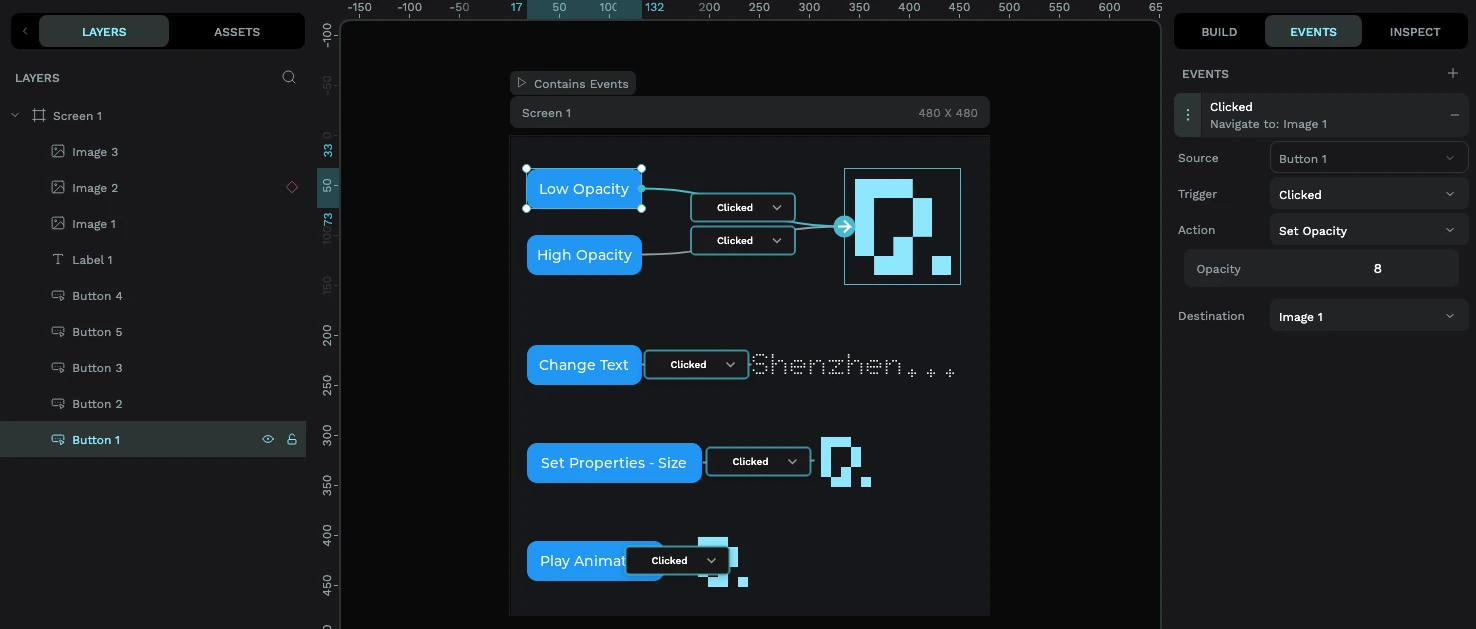
Prefer not to drag? Click the + button in the Events panel instead and fill in the trigger, action, and destination from dropdowns. Same result, pick whichever feels natural.
Choosing a trigger
The trigger is what the user does. Click the node on the wire (or the Trigger dropdown in the Events panel) to choose one. The most common by far is Clicked, but there's a full set:
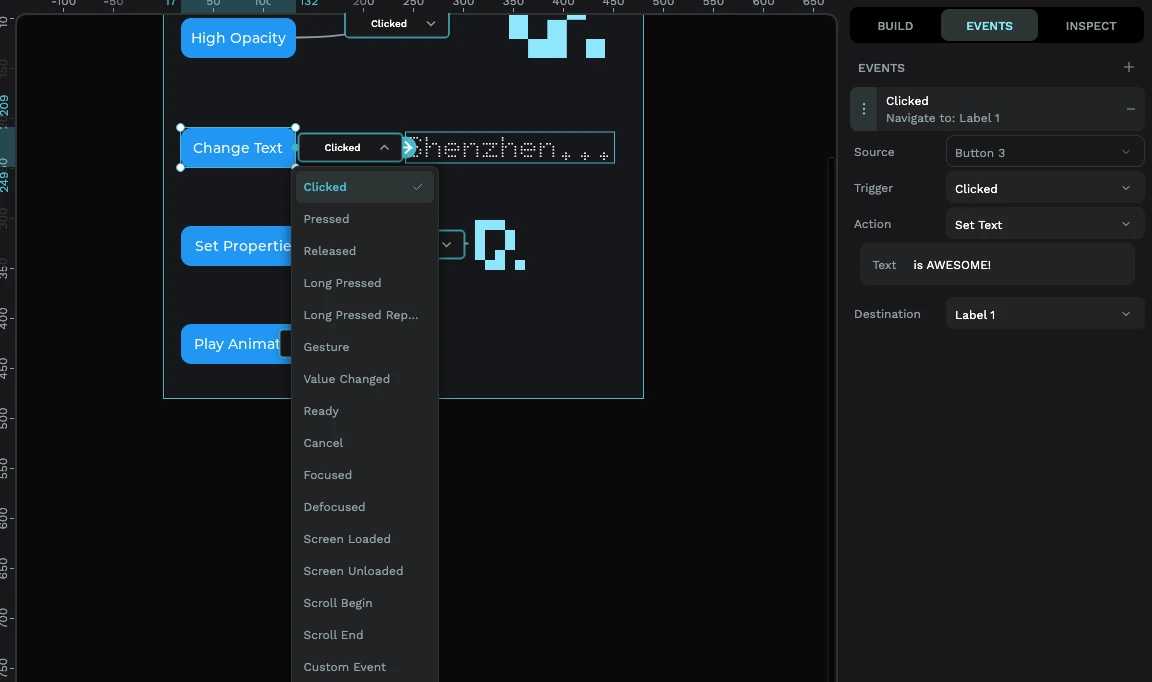
- Clicked, a tap-and-release. This is your everyday "button press" and the one you'll use most.
- Pressed, the instant a finger touches down.
- Released, when the finger lifts.
- Long Pressed / Long Pressed Repeat, held down, or held and repeating.
- Gesture, a swipe.
- Value Changed, when a widget's value changes: a slider dragged, a switch flipped, a checkbox ticked. This is the natural trigger for sliders, switches, and rollers.
- Focused / Defocused, when a widget gains or loses focus.
- Screen Loaded / Screen Unloaded, when a screen appears or goes away. Great for setting things up the moment a screen opens.
- Scroll Begin / Scroll End, when scrolling starts or stops.
- Ready / Cancel, used by inputs like the on-screen keyboard.
Pick a trigger that fits the widget. Clicked makes sense on a button; Value Changed is what you want on a slider or switch. Choosing the right trigger is the difference between an event that fires and one that never does.
Choosing an action
The action is what happens. Here's what you can choose, in plain terms:
- Change Screen, navigate to another screen. You can pick a transition (Fade, or Slide left/right/up/down), and set its speed and delay. This is how you build multi-screen apps.
- Delete Screen, go to another screen and free up the one you're leaving (handy on memory-tight devices).
- Show Widget / Hide Widget, reveal or hide something. Perfect for pop-ups, panels, and "more info" sections.
- Set State, add, remove, or toggle a state like checked, disabled, focused, or pressed on a widget.
- Set Opacity, fade a widget from fully visible (100) to invisible (0).
- Set Properties, change a widget's position or size.
- Set Text, update the words shown on a label or button.
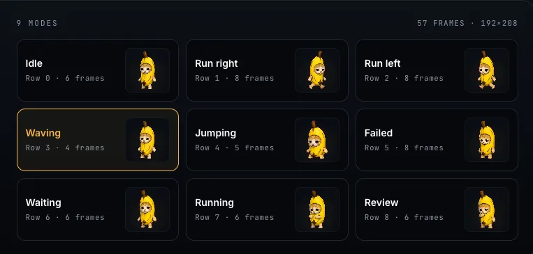
- Set Sprite Mode, switch a sprite to one of its phases (like "Idle" or "Running"), or start/stop it. This is exactly how you give a sprite its spark of life.
- Animated Image Mode, start, stop, or restart an animated image.
- Play Animation, run a timeline animation you've set up on a widget.
- Modify Flag, for finer control, add/remove/toggle an LVGL flag (an advanced option).
- Call Function, call your own custom C function by name. This is the escape hatch for anything custom; you write that function in your firmware.
A worked example
Say you've got a Home screen with a "Settings" button, and a separate Settings screen. To wire them up:
- Select the Settings button.
- Drag a connection from it to the Settings screen (or pick it as the destination in the Events panel).
- Set the trigger to Clicked.
- Set the action to Change Screen, with the destination as your Settings screen.
- Optionally choose a Slide left transition so it feels like moving forward.
Hit the play button and tap the button in the live preview, you'll slide straight to Settings. No code, no flashing the device.
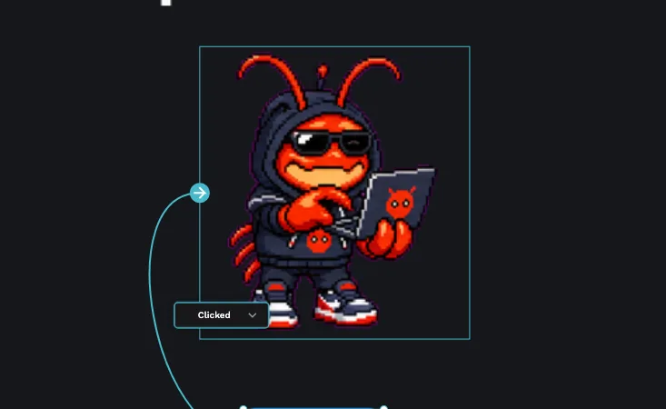
Want a character to react? Add a button, set its trigger to Clicked, choose the Set Sprite Mode action, point it at your sprite, and pick the phase to switch to (say, "Happy"). Now tapping the button changes the sprite's animation. See the sprites guide for how to build the sprite itself.
Editing and deleting events
Every event you create shows up as a card in the Events panel:
- Edit, click a card to expand it and change the trigger, action, destination, or any of the action's options.
- Delete, use the ✕ on the card to remove that event. Its wire disappears from the canvas too.
You can attach several events to the same widget, for example, one on Pressed and another on Released, to build richer interactions.
Where to go next
Events are what turn a static mock-up into a real interface. From here:
- Build animated, multi-state widgets to drive with Set Sprite Mode in the sprites guide.
- Keep your text crisp and small with the fonts guide.
- Ready to put it on hardware? Follow the ESP32 tutorial to export and flash your interactive UI.