Overview
A theme lets the same interface take on a different appearance without making a separate copy of every screen. You define a shared color name such as primary, give that name a different value in each theme, and apply the name to your widgets once. Switch themes and every property using that token updates with it.
At the LVGL level, a theme is a collection of styles. PicoPixel gives you a visual workflow for the same core idea: create themes, define their color tokens, bind widget properties to those tokens, and change the active theme with an event. This guide builds a light and dark example, then adds a button that cycles between them.
The complete flow is:
- Create your themes.
- Add matching color-token names to every theme.
- Apply a token to one or more widget color properties.
- Add a Set Theme event so the user can switch themes.
The token name is the connection between themes. If the light theme uses primary, the dark theme must also use primary with the exact same spelling. The values can be completely different.
Plan your theme colors
Before opening the editor, decide which colors should change together. Name tokens by their job rather than their current appearance. primary, surface, text, border, and danger remain useful if the design changes later; names like bright-pink become misleading as soon as another theme makes that color cyan.
You can start with just one token. In this example:
- The light theme gives
primarya neon pink value. - The dark theme gives
primarya bright cyan value. - Both themes use the exact token name
primary.
Once that works, repeat the same pattern for the rest of your palette.
Keep larger palettes organized with dot notation
If you want separate color sections for different screens or parts of your interface, use a dot in the token name. PicoPixel treats the text before the dot as a group and displays the tokens beneath it in a tree-like list. For example:
dashboardprimary(dashboard.primary)
screen1primary(screen1.primary)secondary(screen1.secondary)
Each group can be collapsed or expanded in the Themes panel, which keeps a larger palette easy to scan. The full dotted name is the token's path, so bind dashboard widgets to dashboard.primary and Screen 1 widgets to screen1.primary.
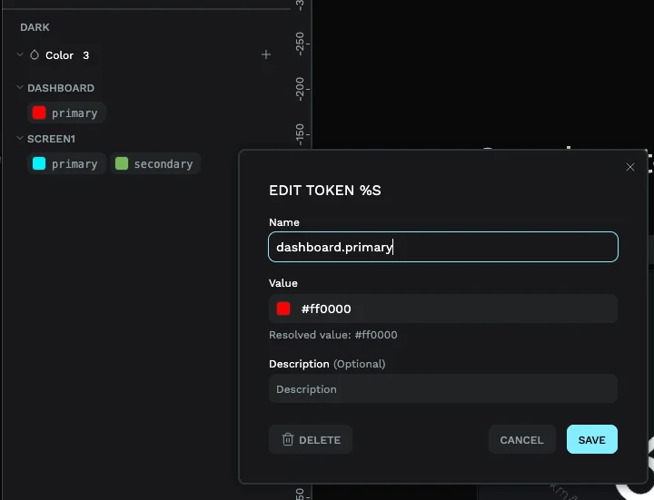
Grouping also lets different parts of the interface vary independently. To make only Screen 1 visibly change between themes, give its screen1.* tokens different values in each theme while keeping the dashboard.* values the same. Set Theme still changes the active theme globally; only the properties whose resolved token values differ will change appearance.
Step 1 - Create the themes
Open your project in the PicoPixel editor, then select the Themes tab in the left sidebar. Use Edit to open the themes list. From here you can enable or disable existing themes, rename or remove them, and choose Add New Theme.
Create at least two themes for this example and name them light and dark. Keep both enabled so they are available in the editor and in the event you will add later.
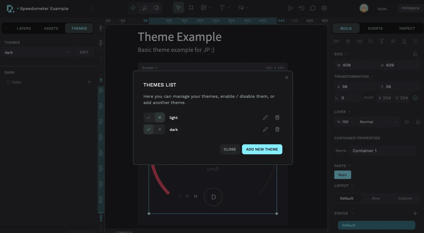
Light and dark are only an example. You can create additional themes for high contrast, different brands, seasonal palettes, or any other visual mode your interface needs.
Step 2 - Add the same token to every theme
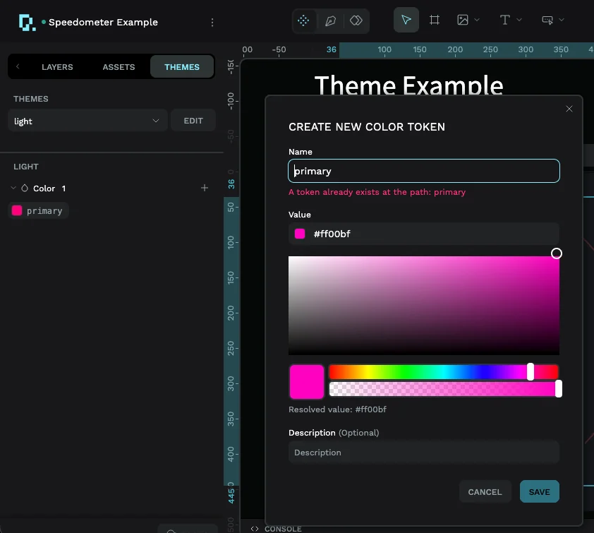
Close the themes list and choose light from the theme dropdown. In the Color group, click the + button to create a color token. Enter primary, choose the light-theme value, and save it. The example uses neon pink.
Next, switch the dropdown from light to dark. Add a color token named primary again, but give this version the cyan value you want in the dark theme.
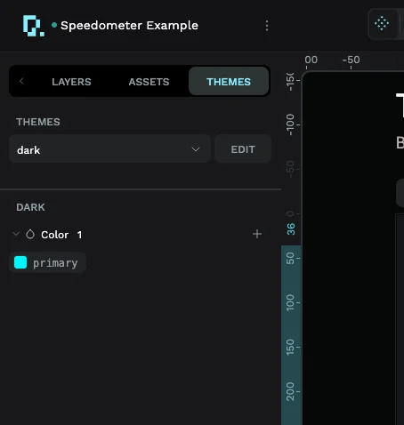
This is the most important part of the setup: the names match, but the values do not have to. A widget bound to primary can now resolve to pink in the light theme and cyan in the dark theme.
A theme cannot contain two tokens at the same path. If PicoPixel says a token already exists, cancel the new-token dialog and edit that theme's existing token. Reusing primary across different themes is correct; adding it twice inside one theme is not.
Step 3 - Apply a theme color to a widget
Select the widget you want to theme. In the Build tab of the right sidebar, find the relevant part and open its color property. In the speedometer example, the arc's Color property is the first place we want to use primary.
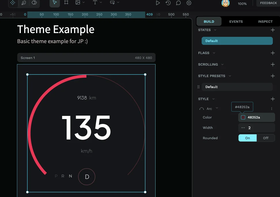
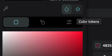
The color picker opens with several tools across the top. Click the icon whose tooltip says Color tokens. It sits next to the regular color controls, so use the tooltip if you are unsure which icon to choose.
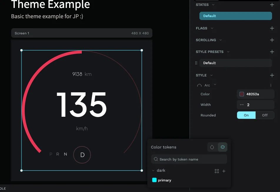
The token browser groups colors by theme and shows the values available for the active theme. Because dark is selected here, primary appears with its cyan swatch. Click primary to bind the widget property to that token.
The property now displays primary instead of acting like an unrelated hard-coded color, and the canvas immediately uses the active theme's value. Switch between light and dark in the Themes dropdown to confirm the same widget becomes pink or cyan without changing the property again.
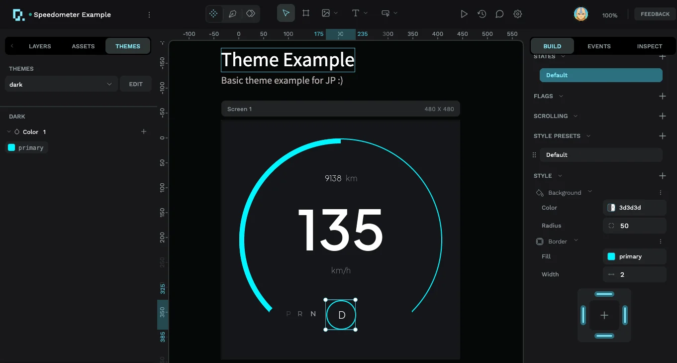
Repeat this for every color property that should react to the theme. A property left on a fixed hex value will stay fixed when the active theme changes, which can be useful for colors that are intentionally constant.
Step 4 - Add a theme-switching event
The dropdown is useful while designing, but the finished interface needs a user-facing trigger. Add a button (or select another widget the user can interact with), open the Events tab in the right sidebar, and click + to create an event. For a button, leave the trigger on Clicked.
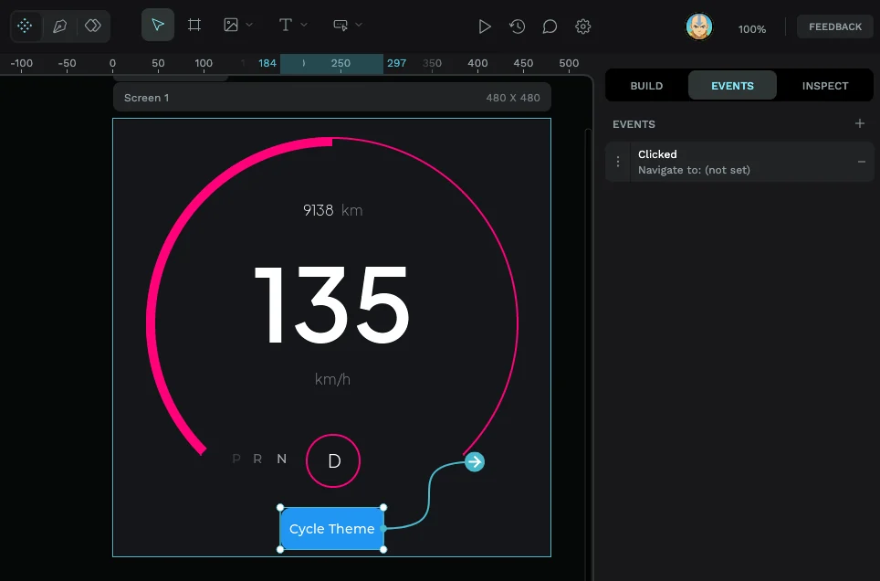
Expand the event and configure it as follows:
- Set Action to Set Theme.
- Choose a Mode:
- Set always activates one specific theme.
- Cycle moves through the themes you select each time the event runs.
- For this toggle-style example, choose Cycle.
- Under Themes, select dark and light. You can select more than two if you want the button to rotate through a larger set.
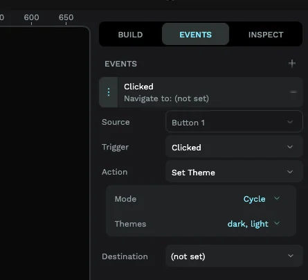
The Set Theme action changes the active theme for the interface, so you do not need to aim it at an individual destination widget. If you want separate controls instead, create one button with Mode: Set and Theme: light, then another with Mode: Set and Theme: dark.
For a deeper explanation of sources, triggers, actions, and event cards, see Using the event editor.
Step 5 - Preview the finished theme switcher
Start the interactive preview and click the button. Each click should activate the next selected theme. The speedometer's primary properties change from the light theme's pink to the dark theme's cyan, while any fixed colors stay the same.
That is the whole system: matching token names make the design theme-aware, and the Set Theme event gives the user control at runtime.
Troubleshooting
The token does not appear in the color picker
Check that the theme is enabled, that you opened Color tokens rather than the regular color controls, and that the token exists in the currently selected theme.
One theme keeps the old color
Open that theme and check the token name character by character. primary, Primary, and primary-color are different names. Also confirm the widget property shows the token name rather than only a hex value.
PicoPixel says the token already exists
That theme already has a token with the same name or path. Cancel the dialog and edit the existing token. The same name should appear once in each theme, not multiple times inside one theme.
Clicking the button does nothing
Confirm that the button is the event's Source, the trigger is Clicked, the action is Set Theme, and the intended themes are selected under Themes. If other events are unfamiliar, review the event editor guide.
Only some colors update
Only properties bound to a color token react to a theme change. Open each remaining color property and select the matching token, or leave it fixed deliberately.
Where to go next
Once primary works, build out a small semantic palette such as surface, surface-raised, text, text-muted, border, and danger. Define every name in every enabled theme, then use those tokens consistently across screens and reusable components. You will be able to refine an entire interface by editing a few theme values instead of hunting through individual widgets.
You can also combine theme changes with other interactions from the event editor guide, or reuse themed controls across projects with PicoPixel libraries and components.