Overview
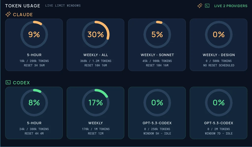
The AI Token Monitor is a free LVGL dashboard template for keeping Claude and Codex usage visible together on one rectangular display. Its 1024 x 600 layout is intended for a wide embedded panel, desktop status display, or dedicated desk monitor where both providers can be compared at a glance instead of checked in separate tools.
The screen gives Claude and Codex their own clearly identified areas while keeping the card structure consistent between them. Each usage window combines a circular percentage indicator, a short plan or model label, a token count, and reset or idle timing. Claude uses a warm orange accent and Codex uses green, so the two providers remain distinct without feeling like separate applications.
This project is a visual UI starting point. The values in the preview are sample content and are not connected to Anthropic, OpenAI, Claude Code, Codex, billing APIs, or local session data. After export, you can connect the labels and arcs to whatever trusted usage source your application provides.
What's included
- One 1024 x 600 LVGL screen, designed specifically for a wide rectangular display.
- Two-provider presentation, with Claude and Codex shown together for quick side-by-side comparison.
- Four Claude usage cards, covering a five-hour window, weekly-all usage, weekly Sonnet usage, and weekly Design usage.
- Four Codex usage cards, covering a five-hour window, weekly usage, and two model-specific limit windows.
- Eight circular percentage indicators, using editable arc objects rather than flattened dashboard graphics.
- Token allowance details, such as
18k / 200k TOKENSand170k / 1M TOKENSin the sample state. - Reset and availability captions, including countdowns, no-reset messaging, and idle-window states.
- Live provider status, with both provider icons and a
LIVE 2 PROVIDERSlabel in the header. - Distinct provider colors, using orange for Claude and green for Codex against a dark navy interface.
- Two imported icon assets and four converted LVGL font assets bundled with the project.
The template does not include configured events or animations. That keeps the project focused on a readable monitoring screen and leaves runtime refresh behavior to your application.
Two providers on one rectangular display
The dashboard is deliberately built around Claude and Codex as a paired view. Claude occupies the first row and Codex occupies the second, so both providers share the same visual grammar and can be scanned in a single glance. This is useful for a developer status panel where the main question is not only “how much have I used?” but also “which provider still has capacity in the current window?”
Within each row, the cards follow the same sequence: a large arc and percentage at the top, the limit name beneath it, then token totals and reset information in compact monospaced text. Repeating the card anatomy means users do not have to relearn the hierarchy when moving from Claude to Codex.
The 1024 x 600 canvas gives all eight cards enough width for readable labels while retaining generous separation between the two providers. It is best suited to landscape rectangular panels rather than round, square, or narrow portrait screens. It can also work as a secondary desktop display, wall-mounted team usage panel, or a compact screen integrated into a workstation enclosure.
Dashboard hierarchy
The header establishes the context before the user reaches the metrics. TOKEN USAGE is the main title, while LIVE LIMIT WINDOWS describes what the percentages represent. At the opposite edge, small Claude and terminal-style Codex icons sit beside the green provider-status label.
Each provider row begins with its icon and name. The orange Claude label and green Codex label create a strong visual boundary without requiring a heavy divider. The cards then carry the detailed information:
- The arc gives the fastest estimate of usage.
- The percentage provides an exact summary value.
- The window or model name explains what limit is being measured.
- The used and allowed token counts add numerical context.
- The reset line tells the viewer when capacity changes again.
The sample values also demonstrate useful edge cases. Some cards show active consumption, some show zero usage, one shows that no reset is scheduled, and the model-specific Codex cards show idle windows. Those states make the design a practical starting point for defining how real data should look when a window is active, empty, unavailable, or waiting to begin.
Asset snapshot
The local library is intentionally small and closely matched to the dashboard:
- Images:
0. - Animated images:
0. - Icons:
2— a sparkle-style Claude mark and a terminal-window Codex mark. - Colors:
0, with the palette currently applied directly to the screen objects. - Fonts:
4. - Components:
0.
The two icons are compact 24 x 24 PNG assets. They are reused in the header and beside the corresponding provider row, giving the screen recognizable provider markers without turning the entire interface into a bitmap.
Typography is supplied through four converted LVGL font assets:
Manrope Semibold 600 14Manrope Semibold 600 18Manrope Semibold 600 32Roboto Mono Medium 500 12
Manrope handles titles, row labels, card names, and the large percentage values. Roboto Mono is used for token totals and timing details, where fixed-width characters help changing numbers remain visually stable. All four assets include the standard ASCII range and use 4 bits per pixel in the included conversion.
Editable LVGL structure
The project contains one screen named Usage Dashboard. Its structure is centered on eight card containers—four for Claude and four for Codex—plus the title, provider labels, live status, and icon objects. Every card contains an arc, percentage label, metric label, and details label.
Meaningful names such as Claude Weekly All Card, Claude Sonnet Arc, Codex Weekly Metric, and Codex Model 7 Day Details make the project easier to understand without documenting every individual layer. The important runtime targets are already separated by purpose, so the visual design can be edited independently from the data-loading code.
The arcs are native LVGL-style objects, the text is made from labels, the cards are containers, and the provider marks are small image assets. That is a much more adaptable foundation than using a single full-screen screenshot: values can change, progress can move, cards can be hidden, and state colors can be adjusted without regenerating the whole screen.
Why this works well for LVGL
The interface maps cleanly to normal embedded UI primitives:
- Arcs represent percentages efficiently, giving each limit a clear progress indicator without requiring chart images.
- Labels hold all live values, including percentages, token counts, window names, and reset captions.
- Containers keep repeated cards consistent, making it easier to preserve spacing when a card is renamed or repurposed.
- Small provider icons are reused, keeping the asset footprint focused.
- The fixed landscape canvas is predictable, which is helpful when targeting a known 1024 x 600 panel.
- Provider identity is redundant, communicated through names, icons, placement, and color rather than color alone.
Because the screen is static in the supplied project, firmware or companion software must provide the refresh loop, data validation, authentication, error handling, and stale-data behavior. A real monitor should make it obvious when a provider cannot be reached instead of leaving an old percentage on screen indefinitely.
Connecting live usage data
Treat the exported UI as the presentation layer. A separate service can read approved local usage records or provider data, normalize the results into percentages and captions, and then send only display-ready values to the LVGL application. The details depend on the device and data source: a networked panel might receive a small JSON document, while a USB-connected desk display might receive updates from a local companion process.
A simplified LVGL update function could look like this:
static void token_card_set_usage(lv_obj_t * arc,
                                 lv_obj_t * percent_label,
                                 lv_obj_t * details_label,
                                 int percent,
                                 const char * details)
{
    if (percent < 0) percent = 0;
    if (percent > 100) percent = 100;

    lv_arc_set_value(arc, percent);
    lv_label_set_text_fmt(percent_label, "%d%%", percent);
    lv_label_set_text(details_label, details);
}
This is only an illustrative UI-update pattern. The source project does not include provider integrations, and API availability, account limits, terminology, and authentication requirements can change. Keep credentials outside generated UI code, avoid displaying secrets, and define explicit loading, stale, disconnected, and error states.
Customizing the template
The existing layout can be adapted without losing its paired-provider concept:
- Replace the sample token values and timing captions with fields from your own normalized data model.
- Rename cards to match the plans, models, or rolling windows that are actually available to your accounts.
- Change a card from “percentage used” to “percentage remaining,” but update the title and arc direction so the meaning stays unambiguous.
- Add a last-updated timestamp or connection badge for each provider.
- Define a neutral unavailable state instead of representing missing data as
0%. - Add warning thresholds while preserving readable text and avoiding color-only alerts.
- Replace Claude or Codex with another provider while keeping the two-column comparison concept.
- Convert repeated card styling into reusable components if you plan to build additional screens.
- Add a compact history view only if the target device has enough memory and the trend helps the viewer make a decision.
- Resize the canvas for another landscape panel, then adjust card count and text size based on physical screen dimensions rather than resolution alone.
If your data source exposes cost as well as tokens, consider a separate screen or mode instead of crowding cost, request count, cache usage, and token windows into every card. The current design works because each card answers one focused question.
Exporting to your project
Open the template in PicoPixel, confirm the display settings, replace the sample states, and rename any objects to match your firmware conventions. Then export the interface as LVGL C code and connect the arc and label references to your presentation layer.
A practical workflow is:
- Open the template in PicoPixel or download the
.picopixelproject. - Confirm that a 1024 x 600 landscape canvas matches the target panel.
- Decide which Claude and Codex limits your data source can report reliably.
- Rename the cards and labels to match those verified fields.
- Add loading, disconnected, stale, and error states before wiring live values.
- Export the UI and its two icons and four font assets as LVGL C.
- Integrate the generated files with your ESP-IDF, Arduino, PlatformIO, STM32, Zephyr, or other LVGL application.
- Update the arcs and labels from a dedicated presentation interface rather than coupling network or credential logic to the screen.
- Check text legibility, refresh behavior, and layout stability on the physical rectangular display.
For the editor import flow, see How to use PicoPixel templates. For a broader embedded integration walkthrough, read the ESP32 LVGL UI tutorial.
Best uses
This template is a useful starting point for:
- Claude and Codex usage displays
- Dedicated AI token monitoring panels
- Rectangular ESP32 or STM32 dashboards
- Developer desk status screens
- Multi-provider capacity comparisons
- Local companion-app display projects
- LVGL arc and label update examples
- Usage-window and reset-timer prototypes
- Dark embedded dashboard design studies
- Projects that need two AI providers visible in one glance
The central idea is intentionally specific: Claude and Codex belong together on the same wide display, with equivalent cards and clear provider identity. That makes the template most valuable when the goal is quick comparison rather than a deep analytics console.